Chicago Sky
The 2021 WNBA Champions needed a major-league brand.
Insight
WNBA logos are often visually weak with icons that look dated and an uncontrolled approach to colors and typography; furthermore, legibility is an issue for many of them, especially important because the logo is used in so many ways—across apparel, merch, signage displays, court floors, ads, ticket stubs, etc. Overall, NBA brands offered a better model in terms of branding that feels stylish and contemporary and registers well across all uses.The Answer
We conducted a full Brand Discovery, analyzing competitors, auditing the current brand, and producing new messaging. Working with the Sky team and our design partner, David Day & Associates, the resulting logo mark is dynamic and contemporary, celebrating Chicago’s world-famous architecture.After extensive research, our team created a logo that meets the quality of a major sports brand and one that elegantly evokes Chicago.
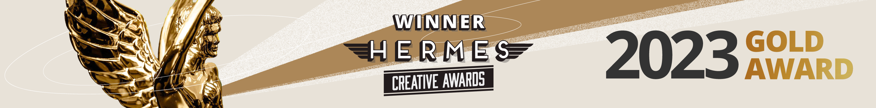
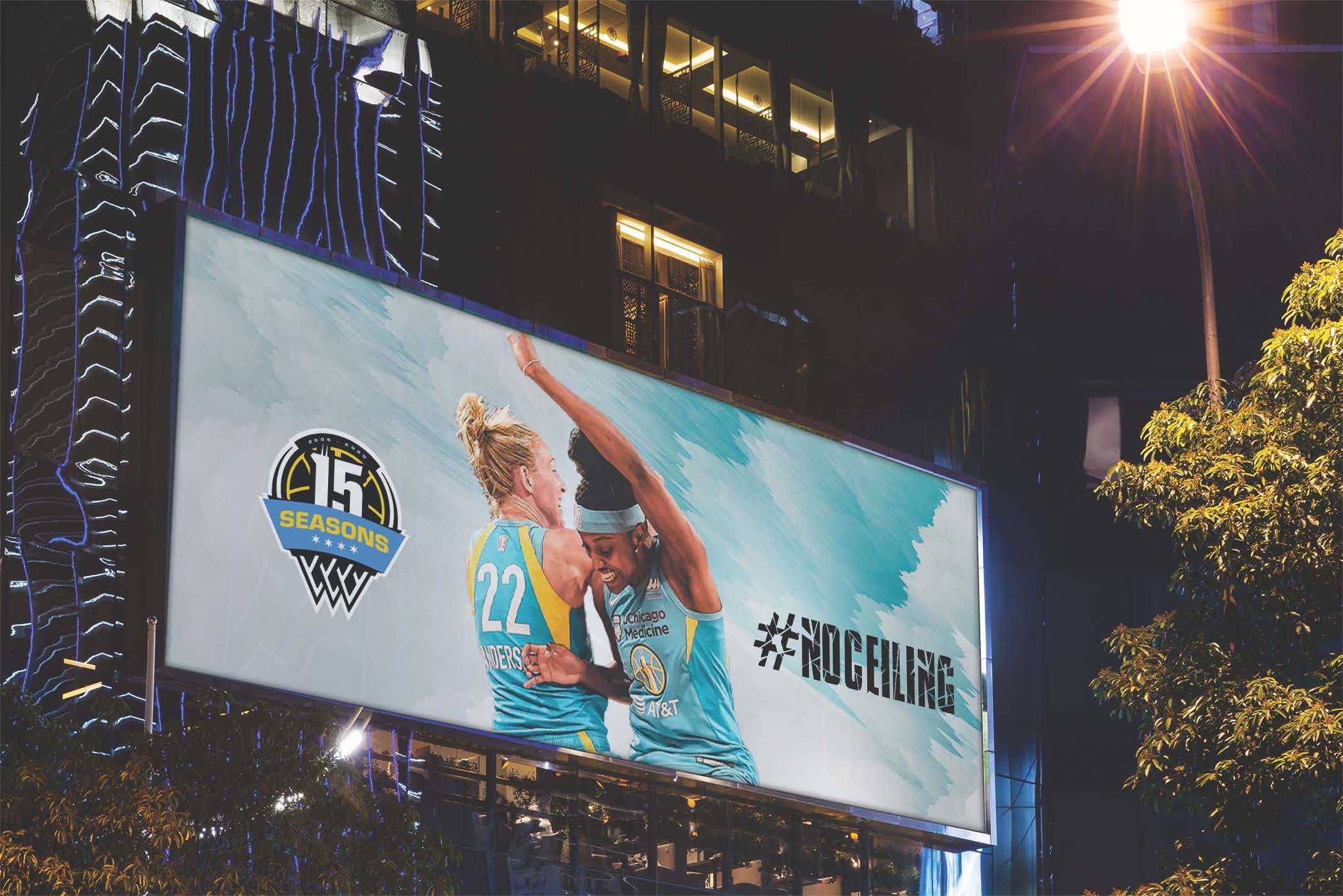
The new Sky brand has become a familiar sight in Chicago, showcased in high-profile downtown locations.
"The new Chicago Sky logo brought a fresh and dynamic new look for our team and has been extremely well received by our fans. Starting a project like this can always seem daunting, but the design team with Silva Brand took the time to understand our needs and were forward-thinking and collaborative throughout the process. The process could not have been smoother."
ADAM FOX, PRESIDENT AND CEO